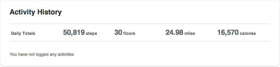
This week for class, I am documenting, sharing and interpreting my activity data (Fitbit). The first five pictures are different views of the data for the past week (10/22-10/27).
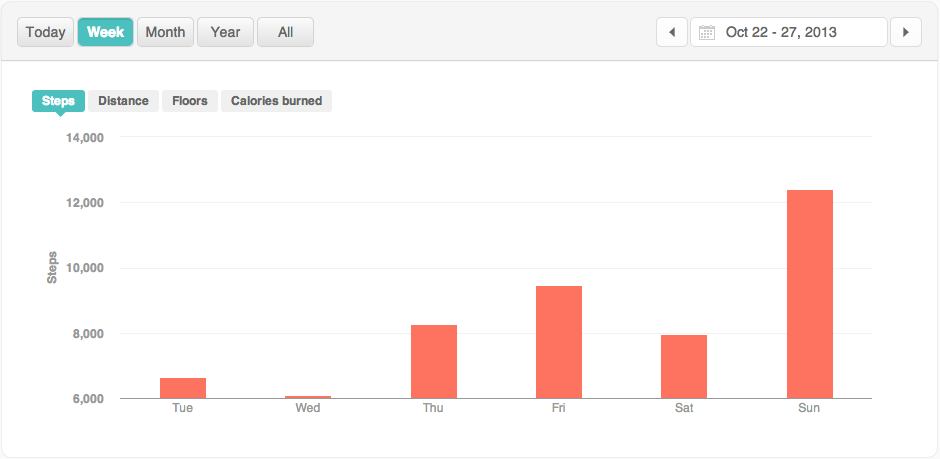
At first glance, one would assume that Wednesday is my lazy day: the bars barely register on the graph. Then you see that there is a somewhat substantial minimum, meaning there is some real activity happening.
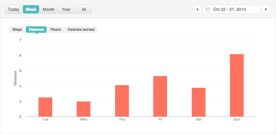
I walk 1.1 miles to school (based off of Google Maps), so assuming I walk there and back on weekdays for class, I have a minimum of 2.2 miles for distance on those days. I walked 3 miles on my slow day (Wednesday), so I wasn’t completely motionless outside of school.
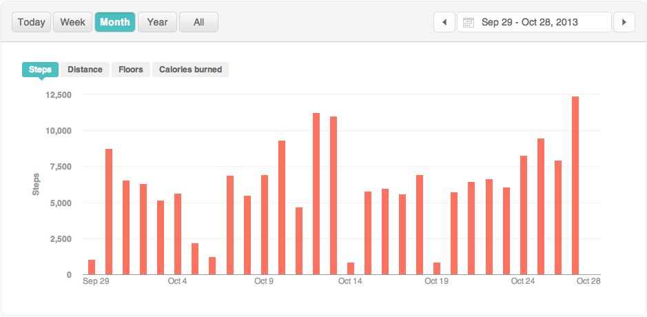
Zooming out and looking at the 6th image, we see the step data for the past month. The story changes and you can see that my lazy days are the weekends. It could be that I’m not doing much of anything on the weekend or it could be that I just don’t wear the Fitbit very much if I’m just hanging around my neighborhood.
The point is that data can tell many different stories, depending on how you frame it.