For this project I was designing a version of our shoppable video interface condensed for mobile viewing. Our desktop interface has a pop-out detail view which is too wide for the popular phones on the market; additionally, the interface depended on many hover states which are not possible on a touch platform.
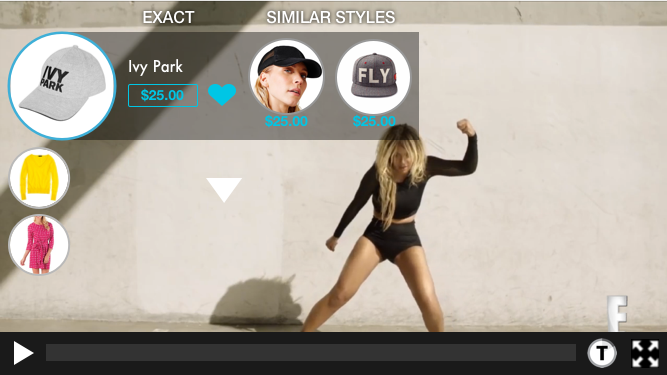
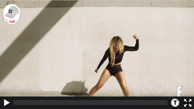
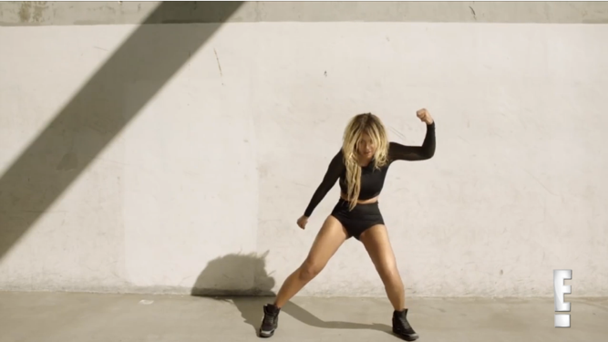
My first iteration involved separate states for vertical and horizontal orientation, as well as running both in a “full screen” mode. The vertical view placed the video at the top and used the space below for information and the shopping interface. The horizontal mode uses the same full pop-out interface that is in the desktop mode. Both use our signature bubbles to toggle through different products that are on-screen at that time.
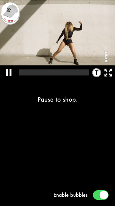

One of the difficulties with this solution is that the white space in the vertical mode goes unused while the video is playing. I experimented with a few ways to utilize that space.
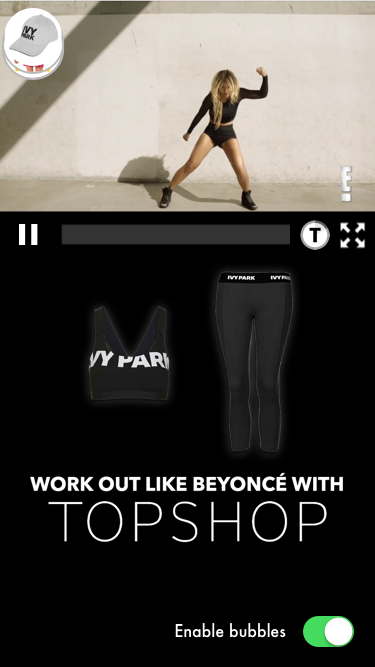
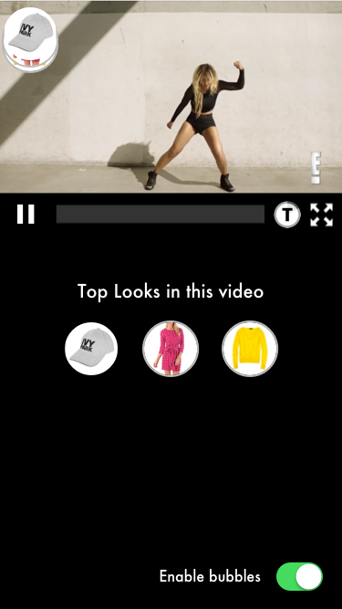
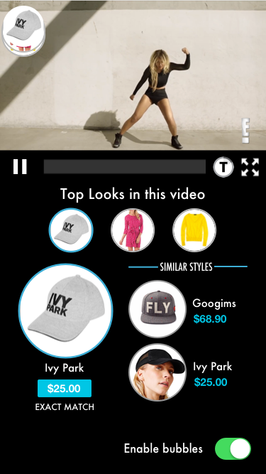
The different interfaces based on orientation seemed confusing. I iterated on several designs to get the pop-out interface to work in vertical orientation.




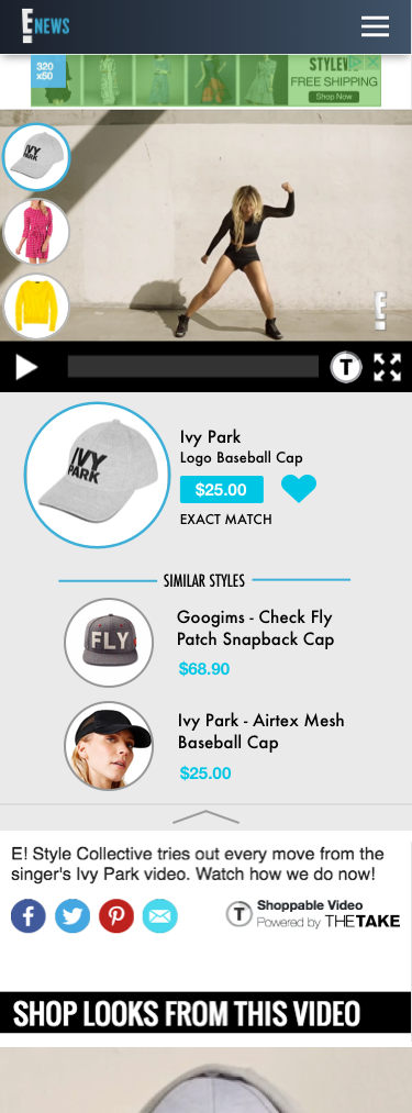
Bringing it all together, I eliminated the white space by not forcing full screen for the video. The shoppable details appear in a collapsable element beneath the video



Tools used: Sketch, Photoshop