Mine UI Walkthrough
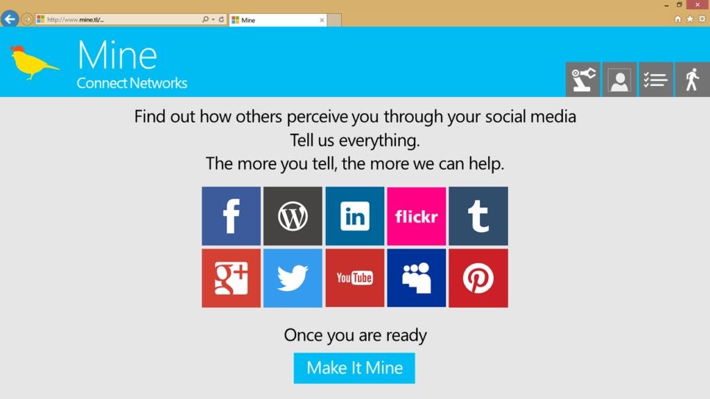
I redesigned the UI for the presentation at MS Research, giving it a more cohesive look. My use of the Metro design […]
I redesigned the UI for the presentation at MS Research, giving it a more cohesive look. My use of the Metro design […]
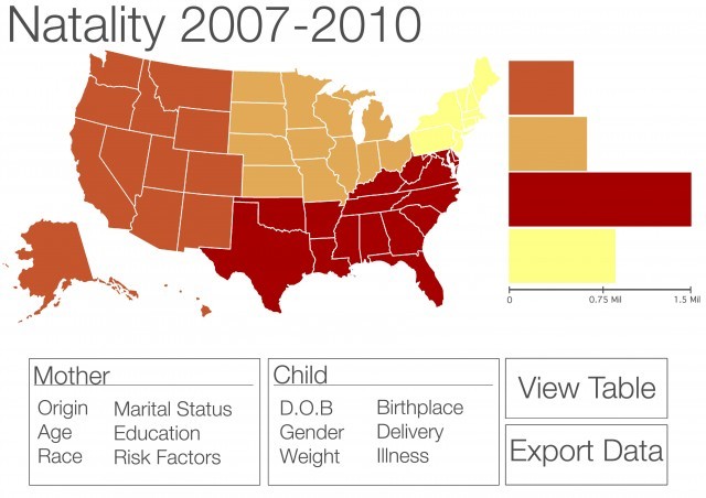
Group project: Wireframe of a data-visualization to improve wonder.cdc.gov. Props to Shilpan who did the visuals! Assignment: Look at the CDC
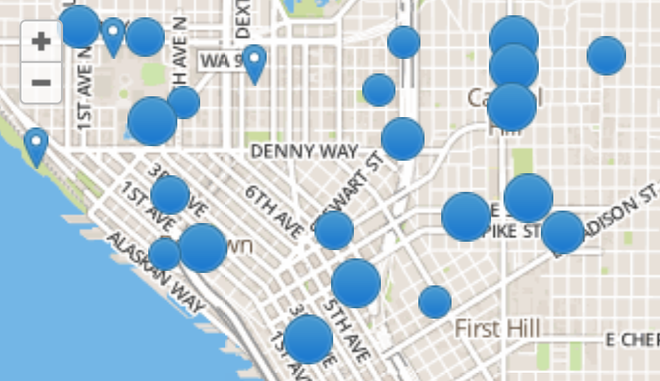
Assignment: in a group, brainstorm two ideas, each of which imagines using two data sources to create a third, combined
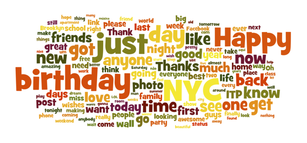
I made a word cloud of the social media posts of the NYU ITP class of 2014
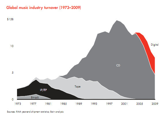
In order to transform publishing into something that actually promotes a healthy ecosystem, consumer demand should be the primary driver